Hello Everyone:
It is a lovely and windy Monday. Before we get started on today's subject, mapping epidemics, a quick reminder that Super Tuesday, Game Day, is tomorrow, March 3, 2020. If you are in one of the fifteen states, including California, that goes to the polls tomorrow and information, please go to usa.gov, sos.ca.gov for California voters, or your state's secretary of state website. Finally, as of writing we says thank you and farewell to three nominee candidates: Tom Steyer, Peter Mayor Buttigieg, and Minnesota Senator Amy Klobuchar (D). For now, let us take about mapping epidemics.
 |
| Mapping a London epidemic nationalgeographic.org |
The coronavirus continues to spread like wildfire, around the world. Having a map to chart the path of the deadly virus is useful to understand how it spreads, where it goes, and most important where to target public health interventions.
Marie Patino of CityLab reports, "One of the best of examples is the dashboard built by Johns Hopkins University's Center for Systems Science and Engineering..." (citylab.com; Feb. 11, 2020: date access Feb. 25, 2020). Using mapping software from Esri, JHU aggregated data from global health officials in real time. Take a look at
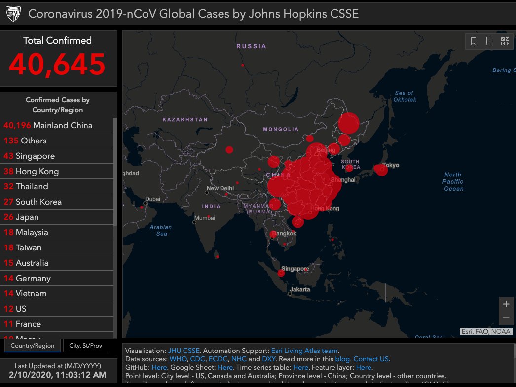 |
| sciencealert.com |
The pandemic threat management company, Metabiota, listed the coronavirus to its list over 130 pathogens is it currently tracking around the the world. Like Johns Hopkins' epidemic tracking map, Metabiota also created a map, albeit with a more pleasing color palette except for the orange dots indicating the presence of the virus, below left. Ms. Patino asks, "But is this really new?"
 |
| Metabiota (@metabiota) twitter.com |
 |
| philadelphiaencyclopedia.org |
Ms. Patino writes, "For centuries, geographers and health-care officials have used so-called geographic information systems (GIS) mapping to craft theories on why a particular outbreak occurred based on the clustering of casualties. Now they can also project how an ongoing epidemic might evolve--in real time--and set policy based on those models" (citylab.com; Feb. 11, 2020) Este Geraghty, the chief medical officer and health solutions director at Esri, told CityLab,
The underlying goal of using a GIS in the past was to develop a greater understanding of what happened, and of some of the root causes,... But today, GIS has evolved, so we can do so much more (Ibid)
 |
| Plague map 1690-92 Attributed to Fillippo Arrieta Bari, Italy researchgate.net |
 |
| Yellow Fever map 1797 (1804) Attributed to Valentine Seaman New York, New York brianaltonenmph.com |
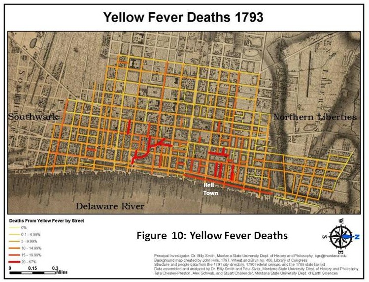
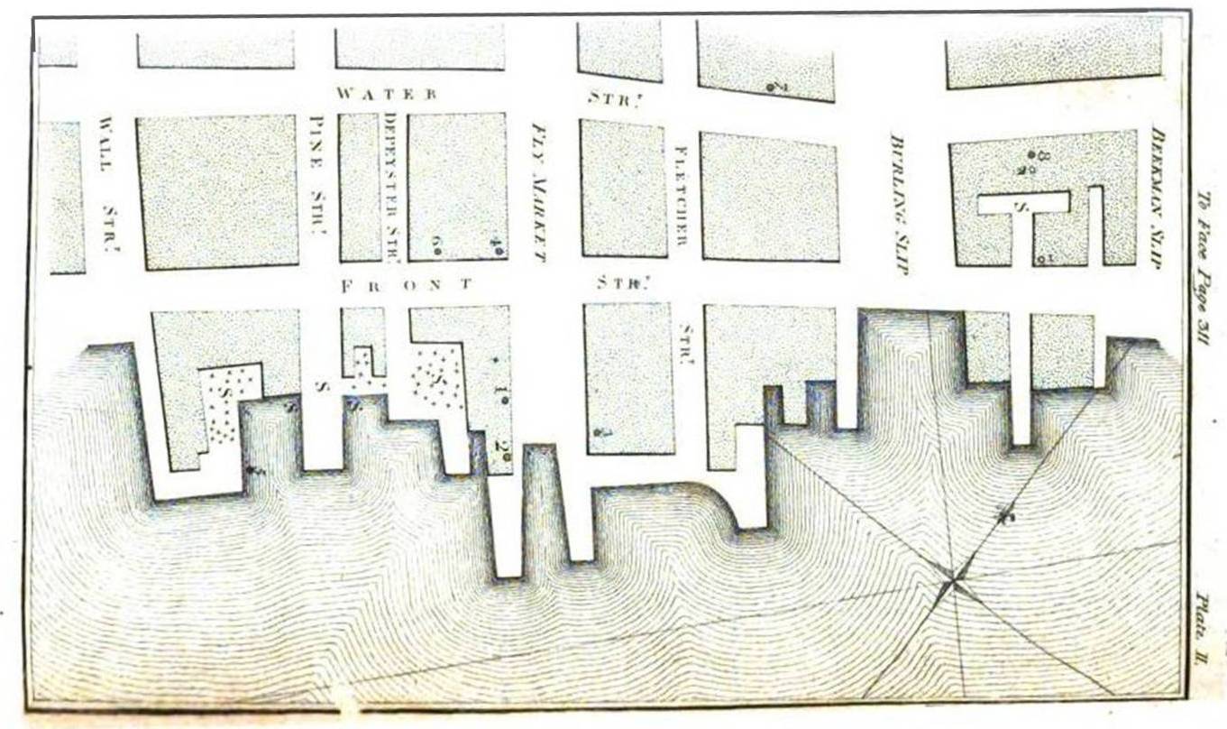
According to Prof. Koch's research, the first truly detailed spatial imagining of an epidemic did not appear until about 1797 and the publication of Valentine Seaman's yellow fever outbreak maps in the Medical Repository (Ibid). Valentine Seaman overlaid the locations of yellow fever outbreak, signified by dots, with the locations of dump and sewage sites in lower Manhattan. Those locations were indicated by a thick letter "S." After analyzing the data, Valentine Seaman concluded that outbreaks of deadly disease with linked to those sites and the putrid odors (Ibid). "Even if Seaman's theory was not quite right--yellow fever is carried by the mosquitoes that were breeding in these wastes--disease mapping was born" (Ibid). Prof. Koch added "Over time, technology improved and disease related data become more available,..."(Ibid). Be that as it may, it was the great cholera epidemic that struck Europe and, in particular, the United Kingdom, that saw a boom in disease maps. In an email, Prof. Koch observed, And then it was...watershed (Ibid).
 |
| Dr. John Snow and a detail from his cholera outbreak map London, England hauntedwalk.com |
 |
| London cholera outbreak 1850 (detail) Attributed to Dr. Richard Grainger researchgate.net |
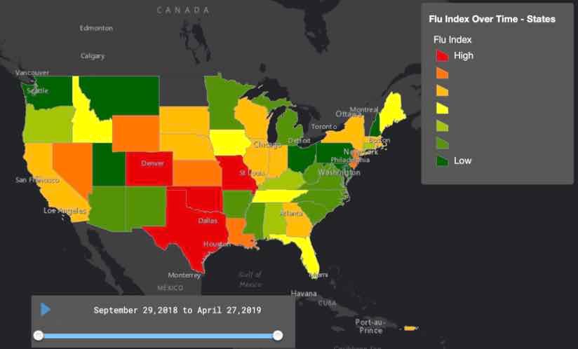 |
| Flu Index in the United States esri.com |
In the digital age, the computer has provided the technology to generate maps at light speed and the internet enables data-sharing and transmission faster than ever. Computers have become extremely efficient tools for their data processing capabilities, resulting in the creation of geospatial models that allow health care officials to follow where an ongoing epidemic, like the coronavirus, and identify high-risk populations. The benefit of geospatial models is that it makes public health interventions possible. Este Geraghty told CityLab, "...when she joined Esri, the public health community was very familiar with GIS." Ms. Geraghty,
They had an understanding and they had been mapping, but they had been doing it with desktop tools, not web-based GIS" (citylab.com; Feb. 11, 2020).
The result is larger datasets more readily available, and GIS users can create their own prediction models based on the datasets. Among the wealth of information available readily accessible is census data, shipping or air routes, and social media content. On that note, Twitter has been extremely useful for people in the hot zones to share their experiences and public health information.
| Esri dashboard map of Zika Originally seen at healthtechmagazing.net No longer available citylab.com |
The dashboard map (above) followed the number of Zika cases in the United States was made available to the public. The states filled in darker shades of red indicate the number of cases.
According to pandemic threat management company Metabiota chief executive officer Nita Madhav, the company "has accumulated and cleaned data 2,400 outbreaks since its creation 2008" (citylab.com; Feb. 11, 2020). Metabiota's epidemic tracker is publicly available but most of its modeling capacities are only available to its clients, including the CDC and the United States Agency for International Development. Ms. Madhav told CityLab,
This [data on previous epidemics] can actually help inform future decision-making,... and can show use that these epidemics should not come as a surprise. This is something that happens frequently over time (citylab.com; Feb. 11, 2020).
 |
| nytimes.com |
The Johns Hopkins dashboard it built upon multiple data feeds. It uses CDC, WHO, ECDC and DXY report--Chinese, American, global data sources. The resulting map is the only reliable data sources, but tracking an epidemic can be tricky: some cases go unreported.
Este Geraghty, at Esri, reflects on where the field of geospatial mapping might go.
GIS is moving in a direction that is maybe more democratized...There is always a need for these GIS professionals, but a lot of people whose job is totally different and need maps to make decisions don't have to have the expertise. They just need to know enough about mapping (citylab.com; Feb. 11, 2020)
No comments:
Post a Comment