Yours Truly hopes you are taking time today to remember the men and women who served their country during World War I and other conflicts. Unfortunately there are veterans of Afghanistan and Iraq that live on the streets of our major cities. As hostile as living on the streets are, the architecture of public spaces make it harder for a homeless veteran just to sit down for a few minutes. New York City has made it harder for a homeless person to sit down for even a few minutes by using hostile design elements to discourage squatters. Critics say the use of metal bars, metal spikes, and bolt lines is inhumane and specifically targets the homeless. The intended message is "don't get comfortable." Keeping the streets clean or inhumane?
 |
| Examples of hostile architecture interestingengineering.com |
Spikes, bars, and bolts have been flourishing in New York City and other cities for some time, even though New York has significantly added public space over the last decade, including green spaces, plaza, and pedestrian areas once used for cars and a renovated industrial waterfront. Supporters of these types of urban design elements say it "is necessary to help maintain order, ensure safety and curb unwanted behavior such as loitering, sleeping or skateboarding" (nytimes.com; Nov. 8, 2019; date accessed Nov. 11, 2019).
However, hostile architecture has drawn fierce opposition from critics who see these measures as superfluous and disproportionately targeting vulnerable populations. They have railed at what they call anti-homeless spikes (Ibid) for targeting the homeless at a time when many cities, including Blogger's hometown, are dealing with the intractable problem of homelessness.
| Another example of hostile architecture cnn.com |
Winnie Hu reports, "In New York, about 79,000 people are homeless, of which about 5 percent are believed to live on the streets, according to federal estimates" (Ibid).
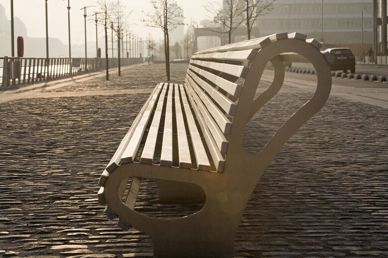
Hostile architecture, like this not too comfortable bench on the left, are subtle, yet effective, way of denying people a place to sit. Other examples can be more obvious like a wall or fence to keep out people or animals. They can be aggressive like metal studs embedded in the sidewalk. These design elements often go unnoticed during a typically busy day. New York University architectural historian and clinical associate professor Jon Ritter told The Times,
We're building barriers and walls around apartment buildings and public spaces to keep out the diversity of people and uses that comprise urban life (Ibid)
 |
| Dubrovnik, Croatia mnn.com |
Cities have historically built walls and fortifications for protection. If you stroll around the city of Manhattan, or any city, what you find are strategically located concrete and metal barriers around buildings and public spaces to deter terrorists attacks. Mr, Ritter offers a different perspective, What is hostile to some is defensive to others,..., (Ibid)
Hostile architecture has also been a feature of some of New York City's over 550 privately owned public spaces, which are required by law to be open to the public in exchange for the right to build taller towers. Since 2007, New York City has specifically prohibited devices that inhibit seating (Ibid) in privately owned public spaces, although armrests are permissible. A 2017 audit (comptroller.nyc.gov; Apr. 19, 2017; date accessed Nov. 11, 2019) by NYC Comptroller Scott M. Stringer revealed that "more than half of the spaces at that time had violated various city requirements and failed to provided amenities that could encourage public use" (nytimes.com; Nov. 8, 2019).
 |
| Curved bench--example of hostile architecture atlasobscura.com |
Since the release of the audit, New York has mandated regular inspections of privately owned public spaces to ensure more public access. Inspectors have checked out 333 properties, of which 193 were ticketed for violations, such as spikes, uncomfortably narrow seating areas, missing signs and other amenities (Ibid). Harvard University urban planning and design professor and co-author of the 2000 book Privately Owned Public Space: The New York City Experience, Jerold S. Kayden documented (apops.mas.org; date accessed Nov. 11, 2019) a variety of spikes, bars, rails, and other obstructions on benches and ledges on the accompanying website. He found other problems like doormen who shooed people away and public spaces hidden behind fences and gates, some of which are kept locked (nytimes.com; date accessed Nov. 8, 2019).
 |
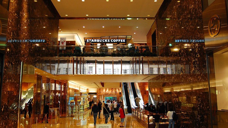
| The Trump Tower Atrium theculturetrip.com |
One example is the public atrium in Trump Tower on Fifth Avenue, a required marble bench was removed (Ibid; July 13, 2015) and replaced with a kiosk hawking Trump souvenirs. Mr. Kayden spearheaded the effort to return the bench to the atrium, noting,
 |
| POPS on East 70th Street New York City, New York rudin.com |
One example is a lush looking public space with fountains, benches, and grass areas on East 70th Street that can only be seen behind a locked metal fence. The property is owned by the Rudin Management Company, who told The New York Times that the fence and gate are "kept unlocked,... intended to keep playing children in so they do not run out in front of cars" (Ibid). Civic minded sentiment but it makes Yours Truly wonder about keeping someone--homeless or other--out. Rudin Management Company chief executive officer and co-chairperson William C. Rudin said,
The park is loved and appreciated by the community, and we have through the years made many improvements to make it even more accessible and welcoming... (Ibid)
One truly ironic example is the plaza on East 56th Street and Third Avenue in Midtown Manhattan. There is not a single place to sit--no table or chairs whatsoever. In the interest of full disclosure, the plaza was built before 1975, when seating was not required. Office workers make do with the nearest wall when they want a quick break. Sean Orlando, an office worker interviewed by The Times, said,
The message is 'Don't hang out here'.... It definitely doesn't feel like a public space. It seems like they're trying to keep people from using it (Ibid)
SL Green, owners of the plaza, declined to speak to The Times.
On East 47th Street, another plaza provided seating on lovely wooden benches. However, until recently, there were prominently displayed "No Loitering" signs. This prompted actor Mia Wagner to wonder,
At what point am I loitering?... It makes me think twice about whether or not to sit, how can I sit, and do I have to buy something so that I'm a valid squatter? (Ibid)
Yours Truly know the dilemma.
Sage Plaza, which owns the property, said it removed the signs in late September as soon as they learned it was an issue. Sage chief executive Johnathan Kaufman Iger said,
We never thought of them as hostile,... That's not what we're trying to convey to the community (Ibid)
He added that metal bars are used to deter skateboarding that would damage the wood.
The social media has taken the cause of hostile architecture by calling out those spaces (stuartsemple.com; date accessed Nov. 11, 2019) that it believes have gone too far. Not even the pigeons are safe.
No comments:
Post a Comment